Noode
PACKAGING DESIGNProject Overview
Noode, a brand dedicated to all-natural, plant-based protein powders, wanted to refine its packaging to better reflect its premium ingredients and modern aesthetic. While the existing design had served the brand well, there was an opportunity to create a more sophisticated and distinct visual identity that would enhance its presence both in retail spaces and on kitchen countertops. The goal was to develop a consistent packaging system that stood out in a competitive market while staying true to Noode’s commitment to simplicity, quality, and natural ingredients.
-
The primary objective was to create a packaging design that:
Reflected premium quality and communicated the high-end, all-natural nature of Noode’s protein powders.
Appealed to a sophisticated audience of design-conscious consumers looking for a refined aesthetic.
Enhanced brand differentiation by establishing a unique and recognizable visual identity.
Maintained a connection to natural ingredients through a clean, thoughtful design.
Created strong shelf presence to attract attention in retail environments.
Ensured consistency across the product range while allowing each variant to be easily distinguished.
-
The redesign embraced a minimalist approach to achieve maximum impact, prioritizing clarity, sophistication, and a strong brand presence. Key elements included:
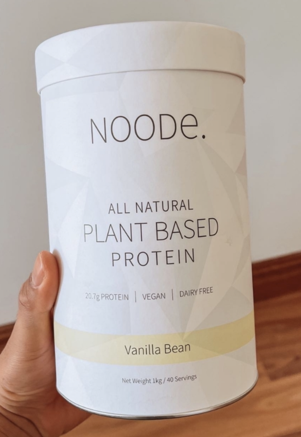
Striking Simplicity: A clean, white background creates a sense of purity and highlights the brand and product information, effectively conveying the all-natural, premium quality of Noode's protein powders.
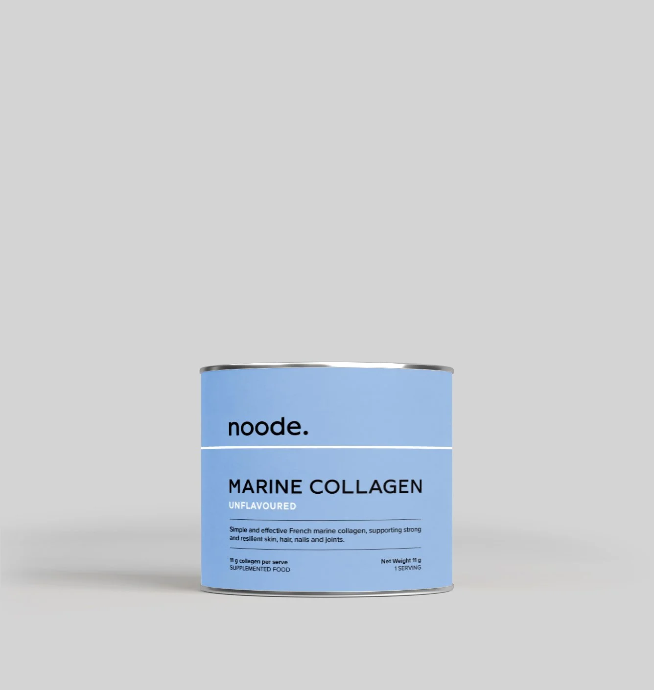
Bold Typography: The brand name "noode." is rendered in a clean sans-serif typeface with a distinctive period. The product name "PLANT PROTEIN" is emphasized in a larger, bolder font, while the flavor "GINGERBREAD" is subtly placed beneath.
Color as a Defining Element: A thin, red line acts as a visual separator and adds a pop of color. This serves as a key branding element, creating consistency across the product range.
Premium Material and Finish: The high-quality container, likely made from metal or thick cardboard, conveys a sense of premium quality, further enhanced by a matte or soft-touch finish.
Focus on Essentials: The design prioritizes the brand name and essential product information, ensuring clarity and legibility.
Consistent Visual Language: The minimalist design and strategic use of color and typography establish a consistent visual language across the entire Noode product range.
This streamlined version retains the key design elements and strategic choices while being more concise and to the point.
-
Elevated brand perception, reinforcing Noode’s position as a high-quality, plant-based supplement brand.
Increased shelf appeal, with a design that draws attention in retail spaces.
Stronger brand differentiation, creating a distinctive and memorable identity.
Attraction of a design-conscious audience, appealing to consumers who appreciate modern, refined aesthetics.
Improved product range cohesion, ensuring a seamless and consistent brand experience.
Enhanced digital presence, with packaging that translates effectively to e-commerce platforms and online marketing.


